
APD アワード開催
Art Work
Food stuff
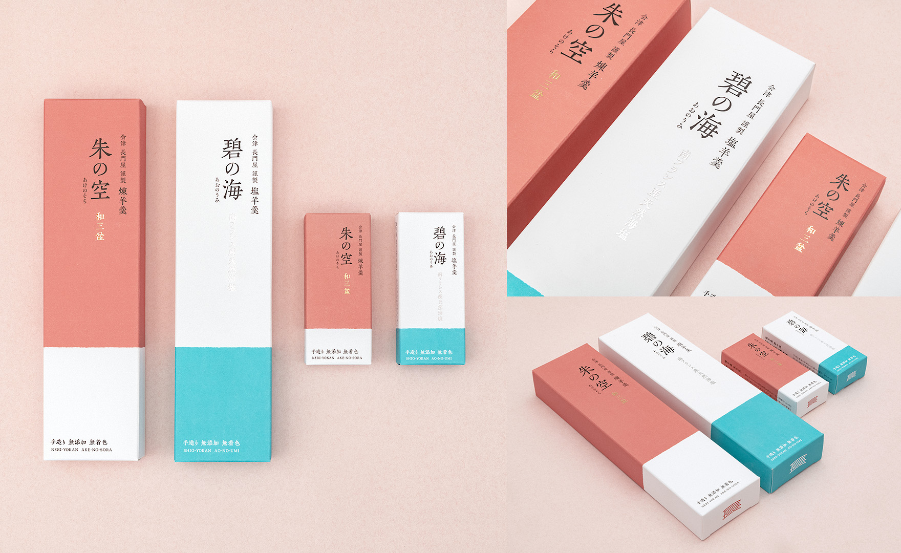
“Nagatoya Yokan” packaging design
Application company: Smash, Inc.HARUHIKO INABAhttps://smash-sendai.jp
JP-1068
Client: Nagatoya Honten Co. Ltd.
Concept: Credit Titles:
cd. d. HARUHIKO INABA
cd. d. HARUHIKO INABA
The traditional Japanese sweet “Yokan” is designed to resonate with the younger generation. “Neri-Yokan” is named “Ake-no-Sora”, which looks like a sunset sky when the cross section of Yokan changes from reddish purple to brown from the outside to the inside. “Shio-Yokan” is named “Ao-no-Umi” with the motif of the blue sea in southern France.